How to Write Clear CTAs That Convert
September 12th, 2017 by
According to Small Business Trends, “70% of most B2B websites lack a call to action.”
With millions of websites in existence, the odds are slim that a user will visit your site and miraculously remember your URL or bookmark it for later viewing. Without a continued, personal connection through an email newsletter, a white paper download, a podcast subscription, a special offer, or another form, it may be the last time that person connects with your business online.
A call to action, or CTA, attempts to establish that connection with your potential customers once they click on your PPC ad and head to your landing page. Even if you’ve got a CTA on your site, it may be deterring visitors rather than inviting them to explore your business. Here are some tips to make your CTA convert visitors into customers.
Start Strong With Action Verbs
There’s not a lot of space to get your point across, so it’s important to get straight to the point. Use an action verb to start your call to action. If you’re in the eCommerce world, consider using words like “shop” to start your CTA, possibly followed by “and save 50%.” The goal is to be direct and informative, highlighting the exact action you want your potential customer to take.
![]()
![]()
Focus on Value and Benefits
As a general rule, think of how you might be able to finish your potential customer’s thoughts for their desires/pain points/expectations, and then use that action verb at the end of the following sentence: “I want to _______.” What was the first thing that came to mind that your clients might choose? Grow more leads? Find shoes that slay? Get My Custom Ad Analysis? Start My Free Software Trial? The answers to this hypothetical question are completely dependent upon your business, but one thing remains true—they need to focus on how you can delight your customer by providing them relevant solutions and unique selling points that make their life or job easier. Instead of phrases like “Buy Now,” which focus on an action a user has to do, get more creative by emphasizing what he or she will get out of clicking that CTA.
In a case study from Unbounce, a B2B website owner reported a 38.26% increase in conversions after replacing just one action verb—Order Information vs. Get Information. With the former, “order” puts the customer in a difficult position—there’s either purchasing the service or not. But with “get,” the potential customer gets to see advantages or rewards. He or she is potentially awarded valuable, relevant information for choosing to continue the buyer’s journey. It’s this combination of value and relevance that can make or break a click.
Another tip about delivering benefits: Don’t make claims or offers you can’t deliver on. This is going to be the start of a potential relationship with a new customer. The last thing you want to do is promise something you can’t afford.


Keep It Short and Be Specific
According to research performed by Dan Zarrella at Hubspot, the most engaging Press Release headlines are between 90–150 characters. The same holds true for crafting landing page headlines and their corresponding CTAs. Be concise, focused, and goal-oriented. Going back to emphasizing value for the customer, consider these more focused and value-driven options.
Generate Leads ⇒ Generate {higher quality} leads by {unique qualifier}
Drive Sales ⇒ Drive {higher value or more} sales by {unique feature}
Measure ROI ⇒ Measure ROI {across all channels} with our {unique product}
Sure, the first versions were about as short as you could get, but the amended CTAs remain concise while giving a more in-depth and accurate portrayal of what the customer will get. Clear copy should help reduce any anxiety or confusion that someone may have about exploring your company. And let’s face it; people have a limited amount of time to explore your content. Make the time they spend on your site valuable, not wasted.
Use Natural Language—Submit or Click Now? No Thanks.
These antiquated terms used to be exciting when it really was a novel concept to be able to click on something and get immediate results. After all, most CTAs before the internet involved a number that you had to call. Now, though, that novelty isn’t the selling point; what you can provide your customer is. When thinking about writing your CTA, think about how you can connect with them. One way to use this in your writing is to use the words “you” and “my/our.” For example, “Drew Brees Can’t Stop Talking About Our Training Program. Learn Why and Get Fit.”
Steer clear of using ornate language by cutting unnecessary adverbs and adjectives. These words may seem like they add value to your copy, but they’re hiding the value that you can provide your customer.
Also, avoid using industry jargon in your copy. This can include words like, “franchise,” “utilize,” “virtualization,” “capitalize,” and especially acronyms that only a limited number of potential customers would even understand, like these marketing big ones: KPI, RSS, CAC, CSS, CRM. Doesn’t look too inviting does it?
Does the Size and Layout of the CTA Matter On a Landing Page?
Just like your copy, your page layout should be neat and clean. Kissmetrics recommends: “The size of your CTA buttons is also important. A too-small version won’t command attention, while a supersized one will make you seem desperate.”
Think about how your landing pages look from a visual standpoint. Avoid the color red for your CTA. There are too many associations with danger, stop signs, stoplights, aggression, etc. You’ll likely see more positive results from calm colors like blue or green.
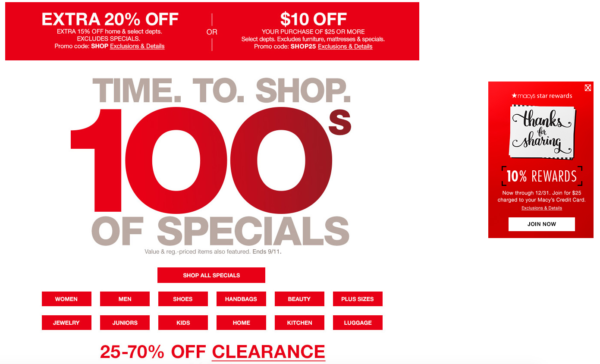
Also, consider the size and spacing of your text on the page. It should be scannable so that a visitor can instantly pick out the information they’re interested in. Cut out the clutter. For instance, here’s an example from Macy’s current main landing page. Aside from the mixed messaging of the different values, can you spot the call to action?


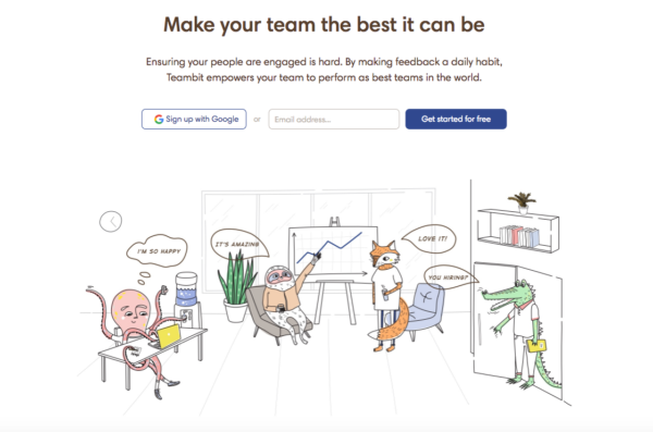
Their “star rewards” offer is shifted to the right of the page. The goal for a button’s CTA is to predict where the user will look next. This one missed that mark. Also, it’s hard to tell what “JOIN NOW” means until you read the tiny print at the top indicating this CTA is for their rewards program. And finally, they’re asking a lot of their visitors to read the fine print on all of these different offers. A cleaner example of a landing page with less clutter and more clarity would be like this one from Teambit, an employee feedback, recognition, and survey startup.


The value? Your team could be the best it can be. Sounds great. How do I go about doing that? Oh, I’ll get started for free. They have detailed information if you scroll through their page about just how they help people. But the reason why it succeeds is because it doesn’t worry about that up front. It focuses on the why with a compelling headline followed by clean copy and a simple CTA. Sometimes, it really is that simple.
A Few Final Ideas for Crafting Great CTAs
In addition to the previously mentioned points, here are a few examples of how you can make your CTAs stand out and drive conversions.
- Make sure to always display the benefits. If you’re offering a free guide, then say so right away (e.g. “Get the Knowledge You Crave – Download Our Free Guide.”).
- Try using a pain point that your potential customers may be hitting. For example, “Tired of Not Seeing Results In Your Ad Campaign? Watch Our Free Webinar to Find Out…”
- Also, you can try using an Influencer who supports and promotes your brand. This adds authority and intrigue to your CTA. Viewers who see that “Mark Zuckerberg Is Crazy About Our Team’s Marketing Ideas” will likely want to click on the corresponding, “Discover Why” button.
- Lastly, utilize testimonials from your current clients. This is a source that people often overlook. Your customers should be the biggest proponents of your brand. If a client has said that you’re the best company they’ve ever worked with, then take that and condense into copy to go along with a short, action-oriented CTA. Of course, always make sure to attribute ownership of the testimonial, and it goes without saying that creating a fake testimonial is a horrible idea for your brand. You’ve got to earn them.
- Numbers are great. If you have some success metrics, consider including them on your landing page. Are 100% of your employees certified in the service you’re promoting? Visitors should know that.
Have any great examples of CTAs in landing pages or other types of content that you’ve seen? Share them with us! A great CTA can have your business seeing more conversions and fewer bounces. Need some more guidance on building a landing page that has strong calls to action that focus on your company’s brand and values? Reach out to us at any time.
Images:


[…] The impact of email marketing’s “prestige” is in the value of the CTA. You might have the most beautiful graphics and wonderful copy, but they won’t matter if your CTA isn’t compelling. That means doing more than coming up with a new way of saying “buy now,” rather, you have to provide recipients with “relevant solutions and unique selling points that make their life or job easier,” writes Matthew Bains at Search Influence. […]