Everything You Need to Create an Effective Landing Page—and Everything You Don’t
July 19th, 2018 by
If you have run any type of digital marketing campaign for your business, you’ve probably come across the term “landing page.” But what exactly is a landing page, and what role does it play in helping to convert leads into customers? Simply put, landing pages are the pages where users “land” after clicking on an ad from Google, Facebook, or a similar platform. When done right, they feature persuasive and highly relevant content, focused on one specific conversion. By directing users to a landing page rather than simply the homepage of your website, you can ensure that you are able to attribute leads to a specific campaign while simultaneously providing a better answer to the search inquiry of the user. A landing page should be specifically focused on lead generation, and these tips will help you have the highest conversion rates once users make it to your page.
Do Have a Compelling Call to Action
A clear call-to-action(CTA) is the most important part of your landing page and should clearly communicate what you want your reader to do on the page. This could be to register for an event, download an eBook, or schedule a consultation. Whatever it is, it needs to stand out from the rest of your content and be one of the only, if not the only, actionable items on your landing page.
If your CTA is a form instead of a button, the title of your form should be much more specific than a simple “Contact Us.” Entice your readers with simple, yet descriptive language like “Register to Get Your Free Marketing eBook” instead. For buttons on your form, avoid generic language like “Send” or “Submit” and instead use language like “Get My Analysis” or “Start My Free Trial.”
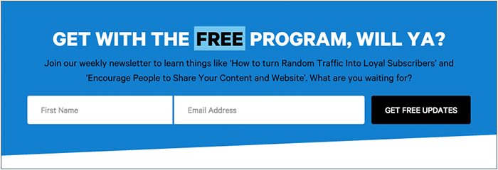
Users are also typically skeptical to give out more information than necessary, so you don’t need to ask for their full name, address, phone number, date of birth, where they went to high school, and their mother’s maiden name if all they’re doing is downloading an eBook. A user is much more likely to actually fill out the form if you keep it short and sweet. Sticking with essentials like their name and email may be all you need.
For more tips on how to craft stellar CTAs that will convert, check out this blog post.
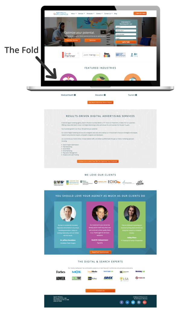
Don’t Cram Everything Above the Fold
We’ve all heard for decades that readers rarely make it below the fold (originally used in reference to traditional newspapers), and that we should try to cram everything important above the fold. This doesn’t hold as true today as it once did, and cluttering the top section of your page can actually hurt your conversions. While it is still true that some users won’t make it below the fold at all, if what you have above the fold is compelling enough to grab their attention, they will scroll down to read the rest of your content. So while, yes, you do still want your CTA and most important information above the fold, try to limit it to just that. No one wants to read anything that is a cluttered mess, and you’ll retain users’ attention much better by avoiding the clutter.
Do Have Fast Loading Speed
A fast page load time is absolutely essential for any web page. Users expect a page to load within seconds, and if it doesn’t, they often abandon the page entirely. In fact, a case study from Hubspot found that a 1-second delay in site speed resulted in a 7 percent reduction in conversions. Images and videos often slow down page load time, so be sure to optimize elements like these to avoid losing users. Luckily, you can test out the load speed of your page and address any concerns.
Don’t Have Endless Content or Jargon
You don’t want to confuse any potential leads with overly complicated, industry-specific jargon. You should be able to demonstrate your expertise in your field without intimidating or annoying any of your users. While you want to give enough information to draw a user in, you don’t want to overwhelm them with too much information up front. If you do have longer content, try breaking it up with bulleted lists or by using icons.
![]()
Do Include Images and Videos
According to Unbounce, videos can increase conversions by about 80 percent—making them a worthwhile investment for your page. Since videos are often quite big and the play buttons can distract from your CTA, consider making your video considerably smaller than the standard minimum of 960px by 720px, with the option to make the video bigger when it’s actually playing.

If you don’t have a relevant video for your page, strong visuals are still extremely important. Avoid stock photography whenever possible, but it’s still better to have stock photography than no imagery at all. Users also respond better to images with faces in them than images without.
Photos aren’t the only type of imagery you can utilize on your landing pages. Depending on the industry, your target audience might respond well to vectors or illustrations, which can also help explain complex subjects when photos aren’t available.
Whatever imagery you do end up using on your page should be consistent with the display, Facebook, or any other type of ads that are driving users to the landing page in the first place. When a user clicks on an ad with vector images, for example, they would expect the following landing page they land on to have similar imagery. If the look and feel of the page is completely different than the ad they clicked on, the user could be confused and think they clicked on the wrong ad altogether.
Don’t Include Navigation
While it may seem counterintuitive to exclude typical site features like a navigation bar, for landing pages, you actually want to include as few opportunities to leave the page as possible. This includes navigation, which can also be distracting and take away from your main call-to-action.
Do Conduct A/B Testing
Once you’ve got your pages built, you should conduct A/B testing by changing out elements of your page to determine what performs best. While audiences typically respond more positively to people in images, for example, maybe yours responds better to objects or vector illustrations. You should also test out CTA placement, button colors, font choices, and content. Keep in mind what you learned in science class though, you only want to change one element at a time when performing these tests. If you change multiple variables at once, you won’t have accurate data on which elements are actually making the page perform better or worse.
Creating landing pages that convert is no easy feat. Unbounce estimates that achieving a 12 percent conversion rate for your landing page will place you above 90 percent of the competition. With a comprehensive online advertising strategy, every step of the process will be clearly catered to your target demographic, making it as easy and risk-free as possible for users to take action. If you want help creating your online presence, reach out to Search Influence to receive your custom marketing analysis.
Great article on how to create a perfect landing page to get maximum conversions. I totally agree with the points mentioned. One point that I believe can enhance the landing page is having an offer on it. Having some offers or what benefit visitor will get right on top of the page will also help to improve conversions. Thanks for sharing!