The Beginning of Google’s Mobile-first Index Rollout Is Underway—Are You Prepared?
May 16th, 2018 by

In 2016, Google announced they had begun testing a new ranking system based on indexing all mobile content first. Now, it’s official. The eagle has landed! The beginning of Google’s mobile-first indexing rollout is now well underway. As Google continues to move toward the big shift, it’s important that your company’s website is ready for the change.
But how do you make the jump? Let’s start from the beginning.
What Is the Mobile-first Index?
Previously, GoogleBot would crawl your website and assign rankings based on the desktop version of your company’s website. Now that about 60 percent of search queries are made from mobile devices, Google is replacing desktop versions of sites in the index with their mobile counterparts via this mobile-first index. As a result, Google will determine rankings based on the quality of the mobile version ahead of the desktop version of the site.
If the mobile performance, content, and user experience are up to scratch, your site receives a better ranking. If they are inferior, other sites will rank higher and you would take a hit.
Ouch.

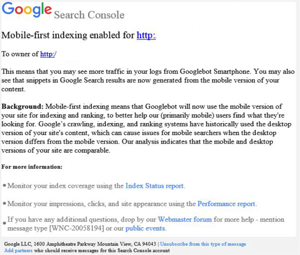
How Do I Know When My Site Will Be Included in the Mobile-first Index?
Beginning this month, Google started notifying site owners and webmasters that their sites are migrating to mobile-first indexing through Search Console. The message looked like this:
How Do I Prepare for the Mobile-first Index?
Here are some tips to get you started.
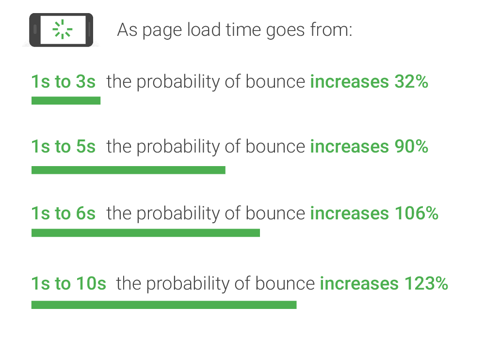
1. Mobile Page-speed
According to Google’s mobile page speed study on Think with Google, as page load time slows down from one second to six, the bounce rate increases by 106%.
So, make sure that your mobile website loads quickly and seamlessly. Google’s PageSpeed Insights is a handy tool for a basic test.
2. Responsive Website
A responsive website that is mobile-friendly works seamlessly across all devices. How do you make a website responsive?
If your website is built on the WordPress platform, then creating a responsive design is very easy!
Jared Jones’ post on the beauty of WordPress will make you a believer.
3. Search Console Verification
If you have separate mobile and desktop websites, verify the mobile version in Google’s Search Console. This proves that you own the site and directly affects how Google interprets and indexes it.
Google’s Search Console help page provides you with all the ammo you need to get this done. More complex solutions for this preparation period includes content and image optimization, on-site directives and redirection, and schema structured data for your website.
Talk to Us!
At Search Influence, we are excited to start seeing the mobile-first index take form!
To fully understand the impact of Google’s mobile-first index on your website, contact us for an audit and review of key aspects of your site’s mobile-friendliness. We’ll help you develop a roadmap to rectify potential risks to your search ranking and the content experience for your customers.
Images:
Awesome article! Google has introduceMobile-first Index software. We are giving you a technical support to the printer error. If you have any issue with your printer simply contact us.