How Can Facebook’s New Profile Layout Affect Your Business?
July 22nd, 2016 by

Facebook recently rolled out a new layout for business pages and the marketing implications could be more than initially meet the eye.

Profile Picture Positioning
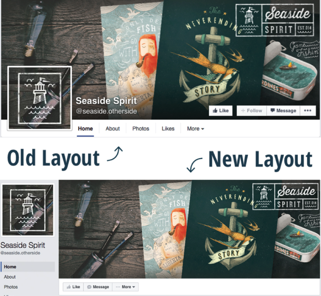
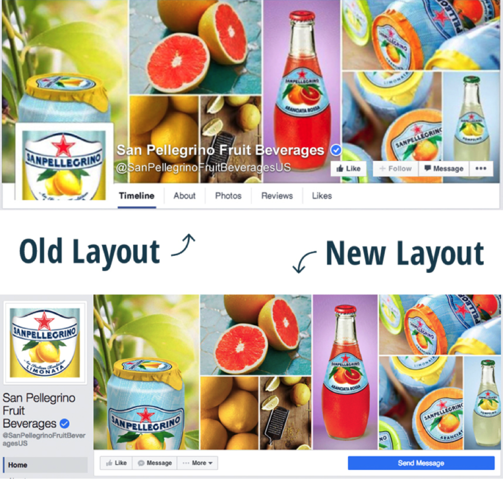
We’ve all seen clever interactive cover photos with the overlapping square profile image on the standard desktop site. A drink from the cover photo is poured into a glass in the profile picture. A man in the profile picture passes a ball to a woman in the cover photo. A giant cat in the cover photo peers down on a tiny human in the profile picture. The square profile image also acts as quick and effective brand recognition when seen standalone in a newsfeed as well as when viewed on the mobile version of Facebook. But with the profile picture now located in the sidebar to the left of the cover photo, the playful effect of the overlapping images is null and void.
Example 1:
Example 2:
How Does the Relocation Affect Your Business?
Although businesses won’t be able to get creative with the overlapping interactive profile images, the relocation of the square profile picture actually frees up a lot of valuable visual real estate on the cover photo that was once covered up by the image, company name, and CTA buttons. Even if you didn’t have interactive profile images on your business page, there’s a lot of space—over 20% of the area of the cover photo to be exact—that was considered off limits for content and is now fair game. Even on the new mobile version of business profiles, the cover photo isn’t covered up by the profile picture or text.
Additional Sidebar Elements
Beneath the profile picture, you’ll also see tabs that were once accessible under the cover photo on desktop sites. In the old layout, only a few tabs were visible, with the additional tabs located in the dropdown “More” option. With the new sidebar, however, all of the tabs are now visible. The buttons that were located on the cover photo itself are also positioned right below it, with the main CTA button located on a more eye-catching blue background. This left-aligned navigation also stays in place while the user scrolls down the page.