
Responsive Design: An Introduction
July 5th, 2013 by
Responsive Design–What’s the fuss about? You hear the phrase “responsive design” but still don’t get it or why you should be paying for it? Allow me to explain it without all of the technical details.
Making mobile versions of your website is common these days, but the implementation can make web developers’ heads spin. First thing to note is there are mainly two different approaches to making your site AWESOME on your veiwers’ devises and/or desktops.
 The first way is to have your main site for desktops and an additional (smaller) site for phones, tablets, and/or ‘phablets’ (phone + tablet), which usually adds to your hosting, looking something like ‘mobil.yoursite.com.’ This works, but it doubles your content, number of domains, and space you are going to need to host such a site. Let’s not forget to mention the fact you will need to edit the mobile site every time a phone is made. Try to count how many sizes of tablets, phones, and monitors there are. Go ahead, I’ll wait. No? Me neither. Just getting up to date is enough to give a developer job security for the next decade. Or make his/her head explode.
Now wouldn’t it be great if your site just magically resized itself no matter what size the screen was and no matter what the pixel ratio was? I’ve beaten around the bush to get to the point, which is that responsive design using CSS (Cascading Style Sheets) can display your site according to the size of the user’s browser window. So whether your customer is on the latest iphone or tablet or wall projector, your site will handle it like a champ, displaying the site elements however you want them at that given size.
Man, can it get any better? It actually does. Because you are using CSS instead of external files, which can bog down your site’s load time, it reacts in real time by styling itself. IT’S ALIVE!! If you’re on a desktop you can do a neat trick. You can actually resize your browser window and watch your site ‘take shape.’
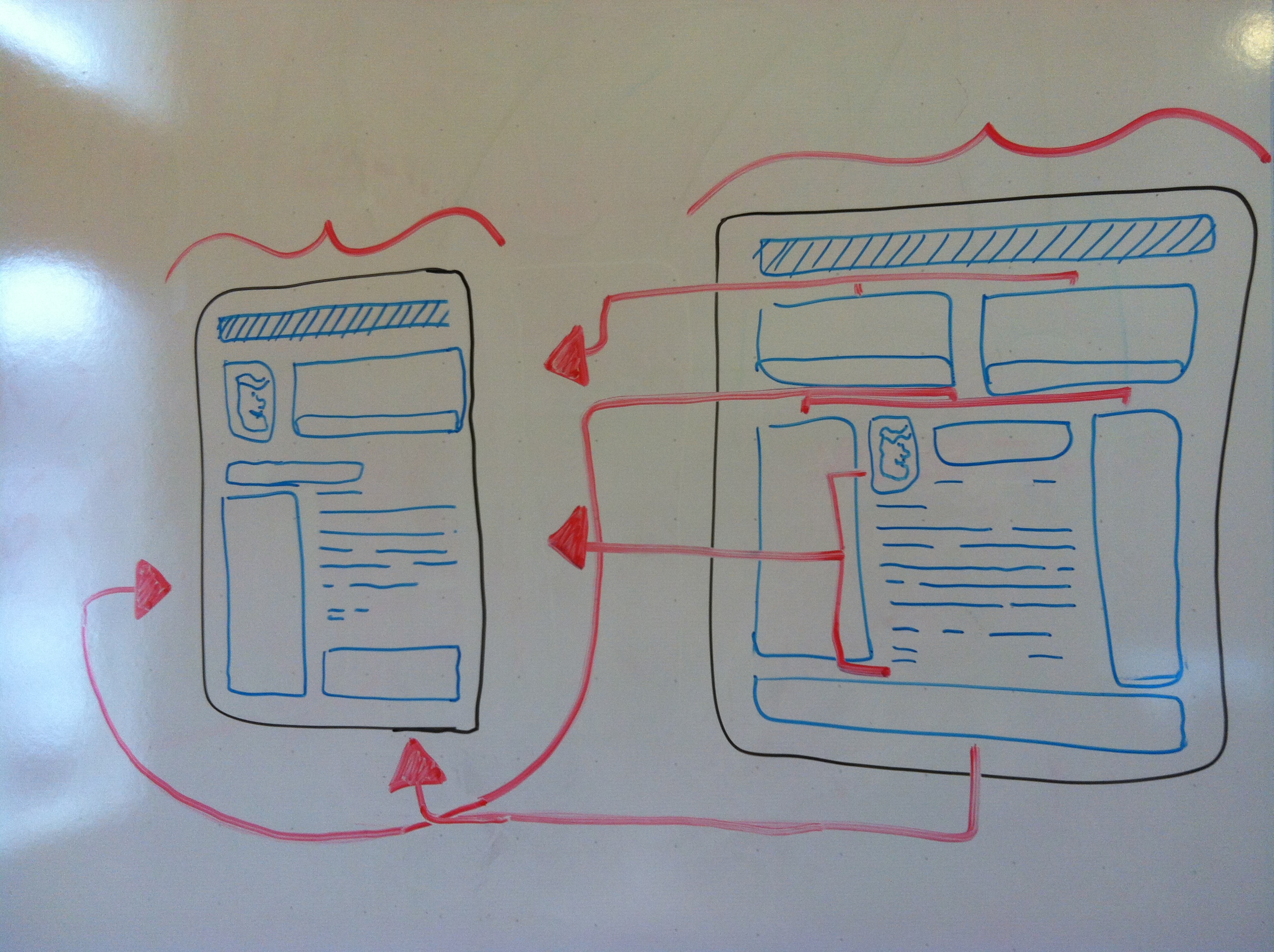
With responsive design, you can change a website’s dimensions without worrying about the design elements.
Use THIS SITE as an example if your site is not yet responsive. The elements on the page should ‘pop’ into new locations as it gets smaller/ larger. This ability to resize your site essentially free of cost it a great asset to your company and can save anyone, even smaller companies, big money.
So responsive design has come a long way and still has a ways to go when it comes to the ever-expanding technologies and the shape of the web. Soon it will be as common term as “social media.” Now you should have a better idea of what people mean when they refer to sites being responsive, and the technical stuff won’t be as alien to you as before.