Skimmers, Swimmers, and Divers: Content Strategy for Higher Education Websites
July 30th, 2021 by
Key Insights
- Higher education sites need to be accessible and navigable for visitors in all stages of the marketing funnel.
- A website optimized for the ultimate user experience can positively impact SEO and search rankings.
- Learn how to create web content that accommodates readers that are skimmers, swimmers, and divers—this can help create a positive user experience that’ll drive returning site visitors!
Website content should accommodate a variety of visitors—you want to create the optimal user experience no matter if visitors are just skimming content and gathering a few key points, swimming around on a few pages, or diving deeply into multiple pages and reading as much information as they can. A positive user experience can increase site dwell time and help drive conversions.
By optimizing your site for skimmers, swimmers, and divers, you’ve established that it’s an informative, helpful resource for your prospect—no matter what stage of the marketing funnel they’re in. Increased site dwell time also sends a positive signal to search engines and can help your search engine optimization (SEO) efforts. A site developed with the user in mind can create a strong sense of trust with the university, making users more willing to convert, whether by submitting basic personal information, contacting the admissions department, or even filling out an application.
According to a study by MeasuringU, the most common reasons for visiting a university’s site are to learn more about the school, browse its academic programs, and view course information. While those may be the top sources of traffic, we know there’s plenty of other valuable content higher education sites can leverage to delight users.
Let’s review common content found on higher education websites and how it can be catered to each type of visitor—whether they’re a skimmer, swimmer, or diver.
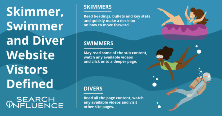
Defining Skimmer, Swimmer, and Diver Website Visitors
While reading this blog, you’ll likely tackle the following content either as a skimmer, swimmer, or diver.
Skimmers will read the headings, bullets, and key stats and quickly make a decision on how to move forward.
Swimmers may read some of the sub-content, watch a video (if available), and click onto a deeper page.
Divers will read all the content on the page, watch a video (if available), and will go to other pages on the site.
My blog post is organized with clear headings, bullet points, and plenty of white space if you’re here to just skim the highlights or even swim a little. I also have in-depth content under each heading, clickable internal and external links, and a straightforward navigation bar if you’re ready to dive into this topic or even deeper to learn more about overall higher education marketing strategies.
Just like a thoughtfully structured blog post that accommodates each type of reader, website content for any higher education institution should be curated to skimmers, swimmers, and divers.
How User Experience (UX) Can Affect SEO
Why are we even trying to accommodate different kinds of site visitors/readers? It all comes down to creating a positive and informative experience for your audience since they’re likely to spend more time on (and revisit) an accessible, easy-to-navigate site. Search Engine Journal points out that Google’s algorithm consistently takes user experience into account.
A site optimized for UX is likely to be awarded in search engine result pages (SERPs). It makes sense that UX and SEO go hand-in-hand—the goal of both is to help readers find the information they’re looking for/complete their task with the most relevant information.
In a previous blog post, we discussed seven actionable steps you can take to make your higher education website more engaging for prospects and students.
Higher Education Website Content
Because a higher education site is extensive and covers so many topics, optimizing content for skimmers, swimmers, and divers won’t look the same for every type of page. When building out content, keep your readers top-of-mind by asking what they want and what they’d like to accomplish from each page.
Let’s focus on three categories of content. All examples and screenshots are from our higher education client, Tulane School of Professional Advancement (SoPA).
Program and Degree Pages
Your school’s academic program and degree pages can become quite information-heavy very quickly. These pages usually contain crucial information on in-depth topics such as:
- Admission requirements
- Required courses
- Transfer credit eligibility
- Tuition
How can you make these topics accessible without overwhelming your readers? Structure them as accordions. Accordions are structured as a vertical menu with clear headers. Users can click these headers to reveal more information about the topic.
Formatting sections of an information-dense page as accordions not only cleans up the entire page, it also minimizes scrolling and lets your readers control how much or how little they want to read on the page.
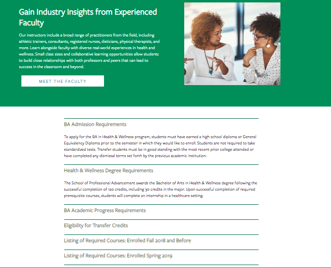
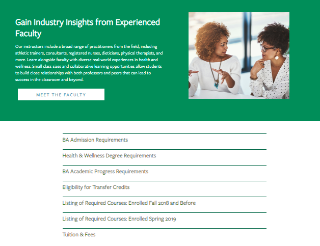
When visiting the above page for Tulane School of Professional Advancement’s health and wellness degree, swimmers and skimmers may review more general information about the degree before they’re ready to dive into logistics like admission requirements and transfer credits. Less content and less scrolling can help readers not bounce off the page because they feel overwhelmed by too much information.
Site visitors who are further down the conversion funnel or even first-timers who prefer to get as much detail as possible can click on each topic to get more in-depth information in the drop-down. Accordion menus give readers control over how much content they can consume at a time—and everyone likes to feel in charge.
Pro tip: Make sure to use clear, concise headers for each accordion section.
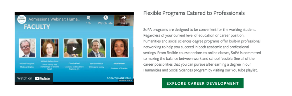
You can also embed videos and other multimedia to enhance on-site text and give swimmers and divers other ways to explore your content during their research.
Acceptance Criteria and Application Deadlines Content
Any information pertaining to an institution’s acceptance and application deadlines should be limited to pages specific to admissions and applying. This content should only be on a few key pages within your school’s site since application and deadline info isn’t evergreen (content that is timeless and remains relevant) and needs to be updated every few months.
When crafting evergreen content for an academic certificate or degree program page, we don’t want to mention the next application date within the content itself. Pop-ups or stick bars can be used to communicate urgency to prospective students browsing your website when deadlines are approaching.
Course Requirement Pages
Most potential students probably won’t dive deeply into course requirement pages unless they’re transfer students.
Having a list of the course names within a program on its dedicated pages makes sense, but having detailed descriptions of each class is more information than potential students need at the moment. Detailed course descriptions are best displayed in a separate on-site course catalog or on an internal site for current students.
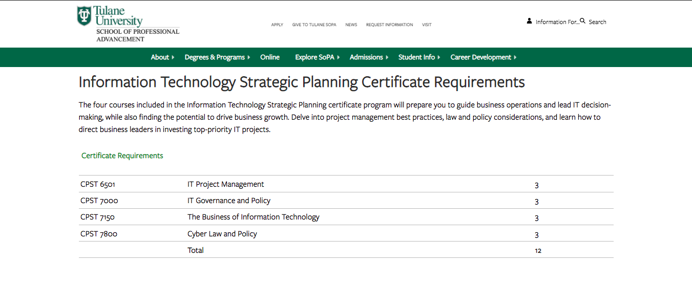
Tulane SoPA lists all the course requirements needed for an IT Strategic Planning Certificate without cluttering the table with course descriptions. The course reference number is listed, so deep divers can look up the course description in the on-site course catalog if absolutely necessary.
Higher Education Blog Content
Following a consistent blogging schedule not only provides useful, industry-relevant content to your current and prospective students, but also keeps your site updated and signals to search engines that it’s trustworthy.
Most of the following guidelines can be applied across your site content, not just for blog posts.
Break Up Content
Structure blogs with subheaders so readers will know exactly what the post covers at first glance. Subheaders—H2s and H3s—visually organize your content and help make it more accessible and scrollable for readers, whether they’re skimming, swimming, or diving headfirst into your blog.
Other ways to break up long lists and paragraphs include:
- Bullet points
- See what I did there?
Images and Graphics
Images are a powerful tool that can make your blog posts pop and entice visitors to read your content. They can also be used to break up content, making it more skimmable for readers intimidated by a wall of text. Try using more than one image. HubSpot reports that blogs with an image every 75 to 100 words get double the shares compared to other blogs.
Pro tip: Use diverse photos and vector graphics to reflect different genders, races, body types, and abilities in your blog images; all prospective students should see themselves represented in your creative.
Infographics can be repurposed as mini-infographics and featured alongside related blog content to add more visual appeal, break up the text, and to expand on information covered in the blog.
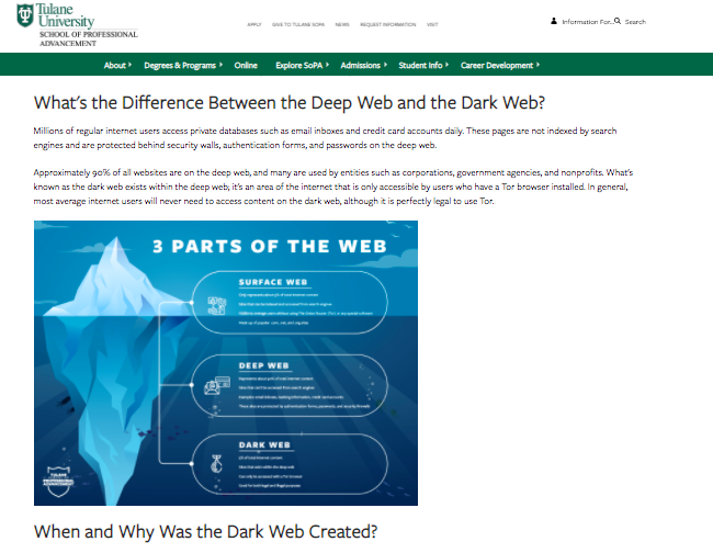
Mini-infographics are excellent ways to include statistics or facts in a more interesting, eye-catching manner.
Links and Calls-to-Action
Help your readers move along the marketing funnel with clear, specific internal links and call-to-action opportunities in all blog content. Internal links should send your readers to additional and helpful pages deeper into your site. Links unrelated to the hyperlinked text or blog content can create distrust with visitors, leading them to bounce off your page.
When creating an internal link, always ask how the page can help your reader. If you can’t come up with a straightforward answer, then ditch that link.
Every blog should end with a call-to-action, or, an opportunity for your reader to take the next step. Depending on where they are in their prospective student journey, this next step could be:
- Visiting a program page to learn about a degree
- Contacting an admissions counselor
- Starting their application
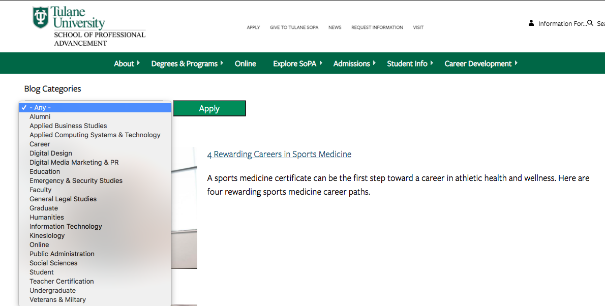
Blog Categories
While this isn’t exactly content-related, sorting blogs by category helps users easily search blogs catered to their interest (enhancing UX!) and can help minimize bounce rate. Even if site skimmers and swimmers don’t do a deep dive into too many blogs, they’ll be able to see the depth of topics covered.
Content Download for Degree Programs
Content downloads are one to two-page info sheets about a specific program or degree. They function as gated content (the user must provide basic info in exchange for access) to capture leads who are interested in this program or degree.
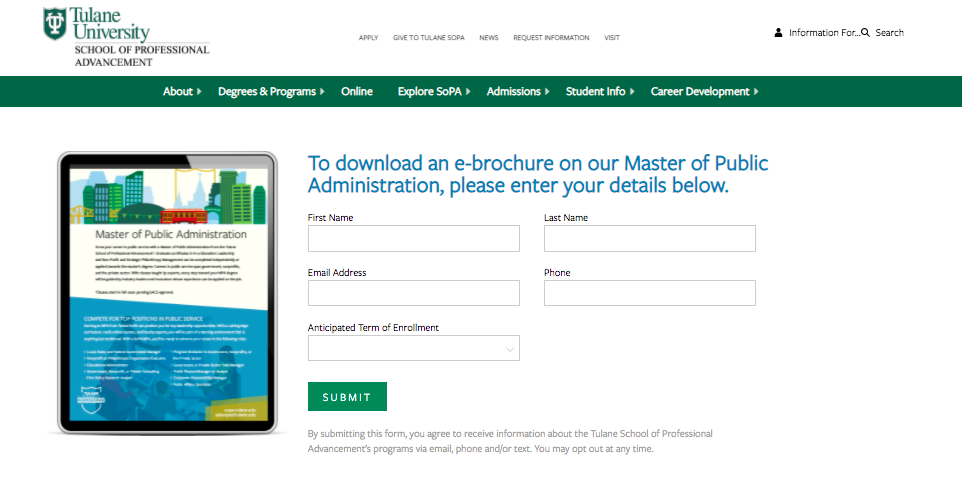
Content downloads can be the ultimate deep-dive for visitors wanting to get as much information as possible. They’re also a measurable way to track site visitors that eventually turn into leads. Divers or visitors further down the marketing funnel are more likely to submit their email to download more in-depth information about a program.
This submitted email can be used as a trigger to launch an email nurture campaign that helps guide potential students along every stage of the marketing funnel.
Elevate Your Higher Ed Content Marketing Strategy With Search Influence
Work with digital marketing experts who can help you lead an effective content marketing strategy that helps you move prospective students down the funnel. Contact one of our strategists today to discuss your lead nurturing tactics and digital marketing strategy.