
How to Use Quantitative Data in Your Higher Ed Marketing and Recruitment
February 24th, 2022 by
Key Insights:
- Having some shared form of internal communication between all departments improves workflow for everyone
- By identifying user touchpoints, you discover opportunities that can improve the quality and/or quantity of your data
- There are tools and platforms available to you to help visualize your quantitative data for easier digestion
Businesses within the higher education category hold a selling proposition not commonly found amongst other industries. Enrolling in a higher education institution gives consumers something both intangible and invaluable—a well-rounded set of knowledge and enhanced values. This makes it that much harder to find the right target market, especially for institutions within specialty fields of study.
Quantitative data allows businesses to identify and feed into their target market, finding new opportunities to improve the student experience at every point during their enrollment journey. According to Attomdata, companies with a focus on data-driven marketing notice a 75% increase in consumer engagement over time. It improves the workflow of all teams involved and acts as a connector between every department, regardless of their end goal.
In this post, we will cover how you can properly utilize and sort all the recruitment data you’ve acquired (no matter how big or small) to improve results for your higher education clients.
The 3 Key Data Challenges in Higher Education Digital Marketing
- Silos within the university: Marketing, enrollment, and administration departments have their own separate systems they use to operate in their day-to-day functions, as opposed to having a shared language between one another
- Data in disparate systems: Having too much or little data pushed through systems that are not capable of utilizing its full potential
- Inability to connect data: Struggling to connect data to the different stages throughout the student journey funnel
These challenges strip the value from collected data and prevent other useful data from coming through. This, in turn, makes the jobs of every involved team member more difficult while also decreasing the number of qualified leads that may have otherwise made it through.
What to Do With Limited Data
When there aren’t enough touchpoints identified in the student recruitment process it makes it nearly impossible to offer any recommendations for developing your higher education digital marketing strategy. This funnel is a great visualization of the touchpoints a typical student reaches throughout their enrollment journey.
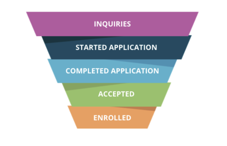
Visualizing Your Funnel
Make an effort to visualize each step of your prospective students’ journey, from the moment they show interest in your institution via form submission to the point they decide to enroll. Segment the data to fit each respective step in that student’s journey. If you haven’t already, make sure to create a buyer persona of your institution’s ideal student so that you have a solid base to work from.
Considering what students think about at different points in the process will help reveal ways to make that journey more seamless. For example, when students inquire about a semester, the actual period they plan on attending tends to differ from the time that they reach out. To accommodate that, we add semester-specific questions to university inquiry forms to offer information that’s relevant to their intended enrollment period and, therefore, more relevant to them.
What to Do With Too Much Data
Sometimes marketers receive a large influx of data with no established method for sorting it. This data can hold value–it just needs to be served to the right team. Breaking the data into easy-to-understand KPIs (key performance indicators) helps us understand it and determine which departments would best benefit from what information.
Micro Marketing Metrics
These metrics speak most directly to those working in marketing-focused teams:
- CPC (cost per click)
- CPM (cost per 1,000 impressions)
- CTR (click-through-rate)
- IMP (impressions)
- IS (impression share)
Macro metrics are ideal for those working on other teams like enrollment and administration:
- CPI (cost per inquiry)
- CPA (cost per application)
- CPE (cost per enrollment)
- CPA (return on investment)
Communicating the Story of Your Data to Stakeholders
To effectively report your results to fellow stakeholders, it is vital that you break down those silos that each team uses by finding a common point for all to connect at. In a recent online poll given during a Search Influence webinar, only ”… 20% of registrants indicated that they “can clearly see/demonstrate the correlation between marketing & enrollment.” This tells us that a serious information barrier exists between the two teams, where there should be a collaborative relationship.
Connecting gives everyone the chance to step back and see the bigger picture of what your data does/how it works together for every team’s benefit. This can be done through something as simple as a weekly marketing meeting, ensuring everyone is on the same page. Frequent meet-ups will give stakeholders unfamiliar with marketing standards a chance to become more acquainted with relevant terminology.
From there, determine all the different touchpoints that your potential students may encounter. This will reveal gaps in between conversions from which more valuable data can be discovered. Then you can figure out how to best extract data from those points to better serve your future students and stakeholders. Finally, collect that data as it rolls in and take advantage of its full potential! When you analyze it correctly, data can reveal user experience problems, internal dilemmas that a student may face at a given stage, and much more. This leads to a world of possibilities that could help create a more friendly, seamless experience for your future students.
Tools to Support Visualization
At Search Influence, we utilize Google Data Studio (GDS) to present quantitative data to our clients and fellow stakeholders. GDS is a great tool that can pull data from various platforms. We use several data tools such as Google Analytics, Facebook, Zapier, Google Big Query, Google Ads, and Slate. GDS visualizes that data for easier digestion between departments and clientele!
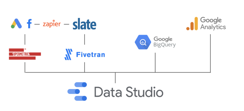
Of its many features, GDS allows you to view your conversions through every touchpoint, by channel (organic search, Google paid search, Facebook ads, etc. ), so that you can identify the best performing channels and improve the others. With many of these platforms, you can generate KPIs automatically based on past data and later edit for easier view in Google Data Studio. Google Analytics, a website-analytics monitoring platform, is a free and popular method of sorting a business’s data, and it’s on the rise.
A recent article done by Marketing Evolution states that “…As of 2020, the use of analytics in marketing was(at) 52.7 percent.” In addition, reporting platforms like GDS let you view your acquired leads by location, which can be used by recruitment teams to decide where to campaign next and to find the most promising areas for building-up referrals. Each business is different, so while you may not have a use for all the previously mentioned platforms, we recommend trying a few to find the ones that work best for your institution. What’s most important is having an understandable and accessible method of viewing quantitative data for all stakeholders.
To wrap it up, there are methods and tools available to assist marketers in the collection, sorting, and analysis of quantitative data. Quantitative data is irrefutable proof of whether or not your strategy is working well for your target market and how you can go about enhancing their enrollment experience. When you implement common language amongst all teams, real discussions start to happen, making the end goal for increased conversions a team effort and, therefore, much less intimidating. Gain more control over your institution’s performance by applying this advice and taking advantage of these widely-used tools. Your next big breakthrough is only a few clicks away!
Need help using your quantitative data to support your higher education digital marketing strategies? For over 15 years, we have been helping businesses collect and analyze data to create real-world results. Contact Search Influence today to fill out a form to get access to our on-demand webinar series.