
Responsive Development with Foundation
August 6th, 2013 by
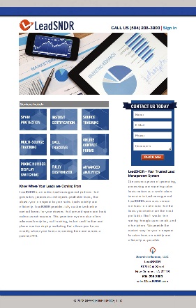 Recently I implemented a redesign of the public facing page for one of our services, LeadSNDR. Like any other from-scratch project, I started off with a CSS framework that included a grid system. My old standby was the popular 960 Grid, but within the last few months, I’ve moved on to something more up to date and responsive, the Foundation Framework.
Foundation is one of many modern CSS frameworks that gives web developers a solid set of tools to create a responsive site. It lets you free yourself from having to agonize over the mechanical intricacies of a responsive layout by standardizing and generalizing common patterns used to create sites of this nature. If you’re already using a fixed layout CSS framework, then switching to a responsive one will take next to no effort. If you’re not using any sort of grid system or something with a similar purpose, then I can’t recommend it enough. A solid CSS grid lends itself to creating really clean and maintainable markup. As an example of the Foundation grid, take a look at the layout shell of the LeadSNDR site.
<div class="row">
    <div class="large-10 large-centered small-centered columns">
	<div class="row">
	    <div class="large-5 small-12 columns"></div>
	    <div class="large-7 small-12 columns"></div>
	</div>
	<div class="row">
	    <div id="header-image" class="small-12 large-12 columns"></div>
	</div>
	<div class="row">
	    <div class="large-7 small-12 columns">
	        <div class="row">
	            <div class="large-12 small-12 columns">
		        <ul class="large-block-grid-3 small-block-grid-3">
			    <li></li> ...
			</ul>
		    </div>
		</div>
	    </div>
	    <div class="large-4 large-offset-1 small-12 columns"></div>
        </div>
    </div>
    <div class="large-12 small-12 columns">
        <footer class="large-6 large-centered small-12 small-centered columns"></footer>
    </div>
</div>
In addition to the grid system, Foundation also includes a variety of components to accommodate a variety of responsive patterns. For example, the various navigation bars are particularly handy components. Building out a responsive navigation isn’t trivial and takes a good bit of doing, but using Foundation makes it pretty trivial.
The only downside to using a responsive framework like Foundation is the lack of support for older browsers. With the newest version, Foundation stopped supporting IE8 and older and the previous version didn’t support IE7 or older. It’s something to be aware of and in some cases it might be a deal breaker, but personally I’d like to see more projects outright drop support for outdated software.
Foundation worked out great for the projects I used it on, but I’m sure it’s not perfect for everyone. Take a look at some of these alternatives if Foundation isn’t exactly to your liking. I haven’t used any of these, but they’re getting their own praises in the community and certainly worth a look.